Each of the following graphs display the sampling results for a specific parameter, such as arsenic. Within these graphs, a box and extending lines represent the results reported at each sampling site. A horizontal line within the box corresponds to the median of the data. The box contains 50% of the data and the vertical lines display the minimum and maximum values. Any data points that fall outside of the acceptable range are outliers and are portrayed as small circles (Figure 5.1).
Figure 5.1: Components of a box plot
For further background on interpreting boxplots, see this figure.
Source Code
# Interpreting Boxplots---execute: echo: falsedate: "`r Sys.Date()`"format: html: code-fold: true code-tools: true code-summary: "Show the code"---## Interpreting Box PlotsEach of the following graphs display the sampling results for a specific parameter, such as arsenic. Within these graphs, a box and extending lines represent the results reported at each sampling site. A horizontal line within the box corresponds to the median of the data. The box contains 50% of the data and the vertical lines display the minimum and maximum values. Any data points that fall outside of the acceptable range are outliers and are portrayed as small circles (@fig-boxplot1).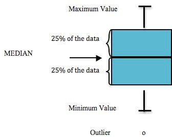{#fig-boxplot1}For further background on interpreting boxplots, see [this figure.](https://r4ds.hadley.nz/data-visualize#fig-eda-boxplot)<br>```{r echo = F, message = F}## initialization# clear environmentrm(list=ls())# load packageslibrary(tidyverse)library(lubridate)library(readr)library(readxl)library(writexl)library(hms)library(plotly)library(DT)library(readxl)library(openxlsx)library(leaflet)library(DT)library(ggpubr)library(plotrix)library(remotes)library(magrittr)library(janitor)library(xfun)library(cowplot)#install_github("USGS-R/EGRET")select <- dplyr::select# set plotting themes## geom_col plots themecol_theme <- theme(axis.title = element_text(size = 14, face = "bold"), strip.text = element_text(size = 14, face = "bold"), legend.title = element_text(size = 14, face = "bold"), legend.text = element_text(size = 14), axis.text = element_text(size = 14))## geom_points plots themepoints_theme <- theme(axis.title = element_text(size = 14, face = "bold"), strip.text = element_text(size = 14, face = "bold"), legend.title = element_text(size = 14, face = "bold"), legend.text = element_text(size = 14), axis.text = element_text(size = 14), title = element_text(size = 18))# function to exclude multiple items per column'%ni%' <- Negate('%in%')``````{r echo = F}##### Notes on data sourcing# Data is sourced from the following queries at <https://waterqualitydata.us> on Feb 24, 2021:# CSV download for SAMPLE data: <https://www.waterqualitydata.us/portal/#bBox=-151.322501%2C60.274310%2C-149.216144%2C60.738915&mimeType=csv&dataProfile=narrowResult># CSV download for SAMPLE SITE data: <https://www.waterqualitydata.us/portal/#countrycode=US&statecode=US%3A02&countycode=US%3A02%3A122&bBox=-151.322501%2C60.274310%2C-149.216144%2C60.738915&mimeType=csv># Note: these CSV files are excluded from the GitHub repository because they are too large to sync. To reproduce the analysis, download and save these files locally instead. (See the ReadMe file at data/WQX_downloads in the repository).# Using these same queries in the future will download the most current csv files that may have received additional data in the interim since the last time this script was run.# We initially attempted to perform the task described above with the dataRetrieval package, but were not successful. See code chunk below.``````{r echo = F, eval = F, warning=FALSE, results='hide',message=FALSE}# Note: in there future, I hope to automatically retrieve the most current water quality data from the EPA WQX# readNWIS won't read the site IDs I try so far ....library(dataRetrieval)# Choptank River near Greensboro, MDsiteNumber <- "10000022"ChoptankInfo <- readNWISsite(siteNumber)parameterCd <- "00060"# Raw daily data:rawDailyData <- readNWISdv( siteNumber, parameterCd, "1980-01-01", "2010-01-01")# Sample data Nitrate:parameterCd <- "00618"qwData <- readNWISqw( siteNumber, parameterCd, "1980-01-01", "2010-01-01")pCode <- readNWISpCode(parameterCd)# determine site IDs# determine parameter IDs10000173``````{r echo = F, warning=FALSE, results='hide',message=FALSE}# prepare data to be used in boxplots# designate download datedownload_date <- "20230215"# import sample datadat <- read_csv("other/input/WQX_downloads/narrowresult/narrowresult.csv") %>% # retain only KWF data filter(OrganizationFormalName == "Kenai Watershed Forum(Volunteer)*") %>% # remove empty columns select_if(~!(all(is.na(.))))# remove extraneous text from "Kenai Watershed Forum(Volunteer)*"dat %<>% mutate(OrganizationFormalName = gsub("\\s*\\([^\\)]+\\)","",as.character(dat$OrganizationFormalName))) %>% mutate(OrganizationFormalName = str_remove(OrganizationFormalName,"\\*"))# import site datasite_dat <- read_csv("other/input/WQX_downloads/station/station.csv") %>% # retain only Kenai Baseline sites (contains "KBL") filter(grepl("KBL", MonitoringLocationName)) %>% # remove empty columns select_if(~!(all(is.na(.)))) # remove extraneous text from "Kenai Watershed Forum(Volunteer)*"site_dat %<>% mutate(OrganizationFormalName = "Kenai Watershed Forum")# Retain surface water sites only. Exclude well sampling sites.# create and apply filter#surface <- c("River/Stream","Lake","River/Stream Perennial","BEACH Program Site-Ocean","BEACH Program Site-River/Stream","Lake, Reservoir, Impoundment","Stream","Spring")#site_dat %<>% # filter(OrganizationFormalName == "Kenai Watershed Forum") #filter(MonitoringLocationTypeName %in% surface)# join site and sample datadat <- left_join(dat,site_dat) %>% # retain only observations with all site data filter(!is.na(LatitudeMeasure))# in the future, use EGRET package (http://usgs-r.github.io/EGRET/articles/EGRET.htmlmaps) for automated database query.# potentially also useful: https://waterdata.usgs.gov/nwis/inventory?search_criteria=lat_long_bounding_box&submitted_form=introduction# What organizations in the database contain the word "Kenai"?# filter if OrganizationFormalName has the term "Kenai"#kenai_orgs <- dat %>%# select(OrganizationIdentifier,OrganizationFormalName) %>%# filter(grepl("Kenai",OrganizationFormalName)) %>%# distinct()# It appears that data after spring 2013 is not in the EPA database.**](Confirmed w/ ADEC in spring 2021; still true in Spring 2023).# What kind of sites are present in our data set?#site_types <- data.frame(unique(dat$MonitoringLocationTypeName))# additional dataframe prepdat %<>% transform(ActivityStartDate = date(ActivityStartDate)) %>% # remove missing observations filter(!is.na(ResultMeasureValue))### Exploratory Data Analysis### Consider including these numbers in section intro# How many years of data do we have, including from the waterqualitydata.us database AND the KWF local server?years_tbl <- dat %>% filter(OrganizationFormalName == "Kenai Watershed Forum") %>% summarise(min_date = min(ActivityStartDate), max_date = max(ActivityStartDate))# Remove air temperature observationsdat %<>% filter(CharacteristicName != "Temperature, air") # How many different kinds of substances have we measured ?total_parameters <- dat %>% filter(OrganizationFormalName == "Kenai Watershed Forum") %>% distinct(CharacteristicName) %>% count()# What are the names of all of substances have we measured ?parameter_names <- dat %>% filter(OrganizationFormalName == "Kenai Watershed Forum") %>% distinct(CharacteristicName) # Create and export table of site namessite_tbl <- dat %>% group_by(MonitoringLocationName,LatitudeMeasure,LongitudeMeasure) %>% summarise(min_date = min(ActivityStartDate), max_date = max(ActivityStartDate)) %>% rename("latitude" = "LatitudeMeasure", "longitude" = "LongitudeMeasure")# export csvwrite.csv(site_tbl,"other/output/field_qa_qc_data/2000_2014_sitenames.csv", row.names = F)# read back in manually edited table with info on maintsem/trib and river milesite_tbl <- read_csv("other/input/baseline_sites.csv") %>% remove_empty() %>% select(-latitude,-longitude)``````{r echo = F, warning=FALSE, message=FALSE}# make corrections where known errors exist from wqx import# UNITS# bacteria - fecal coliform should all be "cfu/100ml"dat <- dat %>% mutate(`ResultMeasure/MeasureUnitCode` = case_when( CharacteristicName == "Fecal Coliform" ~ "cfu/100ml", TRUE ~ `ResultMeasure/MeasureUnitCode`))``````{r echo = F, warning=FALSE, message=FALSE}## Miscellaneous tasks### Additional site info# Join additional site info to overall dataset# join by coordinates# round coordinates on both dataframes to same number of decimals (5)# z <- dat %>%# left_join(dat,site_tbl, by = c("MonitoringLocationIdentifier","MonitoringLocationName"))# 2/15/2023: having some trouble with this join for unknown reasons. # So, instead, we can extract trib/mainstem info and river mile from the existing MonitoringLocationName column (KBL_t_00.0 = kenai baseline tributary mile 0)dat %<>% separate_wider_delim(MonitoringLocationName, delim = "_", names = c("project","trib_mainstem","river_mile"), cols_remove = F)# transition column names to "easier" formatsdat %<>% clean_names()# export csv to provide column format names for manually curated outlier xlsx file in the same folderwrite.csv(dat,"other/input/outliers/baseline_outliers.csv")# Create column of tributary names (e.g. Beaver Creek) to associate with tributary river miles# read in tribuary namestrib_names <- read.csv("other/input/baseline_sites.csv") %>% select(MonitoringLocationName, tributary_name, tributary_mainstem) %>% filter(tributary_mainstem == "tributary") %>% clean_names() %>% select(-tributary_mainstem)# join trib names to overall tabledat %<>% left_join(trib_names, by = "monitoring_location_name")# create general "site name" column. use tributary name if available, and river mile if notdat %<>% transform(river_mile = as.character(as.numeric(river_mile))) %>% mutate(site_name = case_when( !is.na(tributary_name) ~ tributary_name, is.na(tributary_name) ~ river_mile))``````{r echo = F, warning=FALSE, message=FALSE}#### Time formats ####### Designate samples as "spring" vs "summer" for each observation ("season")# choose a "boundary date" between spring and summer (see appendix "Sample Event Timing" for rationale)# boundary date selected is June 4 (julian day 155)boundary_date <- 155dat %<>% mutate(julian_day = yday(activity_start_date)) %>% mutate(season = case_when( julian_day > 155 ~ "Summer", julian_day < 155 ~ "Spring" ))## working here 2/17/2023# next: go through process of identifying which observations exceed ADEC and/or EPA limits``````{r echo = F, warning=FALSE, message=FALSE}# exclude outliers with an inner_join function# see manually identified outliers at "other/input/outliers/baseline_outliers.xlsx"outliers <- read.xlsx("other/input/outliers/baseline_outliers.xlsx") %>% select(activity_identifier,characteristic_name)dat <- anti_join(dat,outliers)``````{r echo = F, warning=FALSE, message=FALSE}# write finalized data that will be used for graphing and analysis to external location # this export format represents the most granular presentation, nothing has been aggregated. The "reg_limits.qmd" script aggregates volatiles, for examplewrite.csv(dat,"other/output/analysis_format/baseline_export_format.csv",row.names = F)z <- read.csv("other/output/analysis_format/baseline_export_format.csv")z1 <- data.frame(unique(z$characteristic_name))# https://stackoverflow.com/questions/40350230/variable-hline-in-ggplot-with-facet# possibly a useful approach, but maybe simpler because in our example the lines don't need to vary by panel```
