6 Interpreting Boxplots
6.1 Interpreting Box Plots
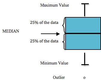
Each of the following graphs display the sampling results for a specific parameter, such as arsenic. Within these graphs, a box and extending lines represent the results reported at each sampling site. A horizontal line within the box corresponds to the median of the data. The box contains 50% of the data and the vertical lines display the minimum and maximum values. All data points generating the boxplot are superimposed atop it (Figure 6.1).
For further background on interpreting boxplots, see this figure from “R for Data Science” by (Wickham and Grolemund 2017).